The rule: smallest bytes that still look right at the target size . Everything else follows from
that.
Directory Directory Directory Directory Directory Directory
src/assets/ → import as ESM, Astro hashes + optimizes + resizes .public/ → served verbatim from /. Use for things Astro shouldn’t touch (favicons, OG previews,
robots.txt, sitemaps).
Which format?
SVG — icons, diagrams, logos with < ~200 shapes. Vector, scales for free, gzips well.AVIF — photos, best compression (25–50% smaller than WebP). Slightly less browser support pre-2020.WebP — photos, universal support today. Astro emits these by default.PNG — pixel-perfect UI screenshots. Larger files; use sparingly.JPG — legacy, rarely the right pick anymore.
title : A post with an image
import { Image } from ' astro:assets ' ;
import hero from ' ~/assets/heroes/kubernetes.svg ' ;
alt = " Kubernetes hero — hexagonal wheel graphic on dark navy "
What Astro does automatically:
Hashes the filename (kubernetes.CzR3v6.svg) — infinite cache.Picks a format based on browser support (raster only — SVG passes through).Emits width / height on the tag to prevent CLS.Generates responsive srcset if you pass a widths prop.
The hero on this page is a hand-tuned SVG. It’s 1.2 KB gzipped vs typically 40–120 KB for a WebP
hero at 1200 px wide.
For real photos, use <Image> with widths and sizes to serve exactly what the viewport needs:
alt = " Astro's mascot, Houston "
sizes = " (max-width: 640px) 320px, (max-width: 1024px) 640px, 960px "
Astro emits three variants and lets the browser pick the smallest that matches the layout.
<Picture /> (also from astro:assets) emits a <picture> with format fallbacks. Use it when you
want AVIF for browsers that support it, WebP for the rest, PNG as a floor :
import { Picture } from ' astro:assets ' ;
formats = { [ ' avif ' , ' webp ' ] }
sizes = " (max-width: 640px) 320px, 640px "
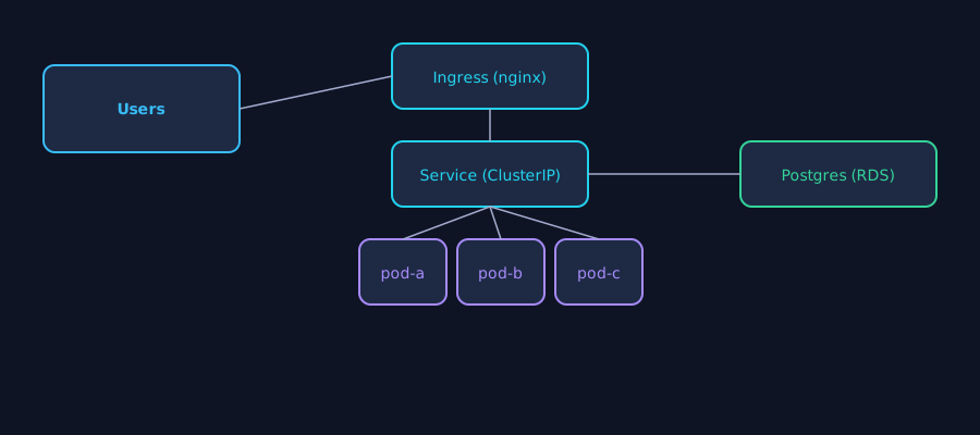
For infra diagrams, hand-authored SVGs beat every raster format. This one is 1.9 KB uncompressed:
Mermaid — quick diagrams that will change, or when you want the source in the markdown itself.Hand-authored SVG — hero graphics, logos, diagrams you want pixel-perfect.
Plain markdown images still work — Astro processes them:
![ Houston ] ( ../../assets/houston.webp )
They render as <img> without the srcset niceties. Prefer the <Image> component in .mdx.
Prop Purpose altRequired. Screen-reader description.loading"lazy" for below the fold, "eager" for above.decoding"async" for everything (default).widthsArray — responsive srcset. sizesCSS-length hint per media query — pairs with widths. quality1–100 for lossy formats. Default 80. formatForce a format (avif, webp, png, jpg). densities[1, 2] for retina.
Target ≤ 50 KB transferred. Prefer SVG. If it must be raster, AVIF at Q60 + loading="eager".
Target ≤ 10 KB . SVG almost always. Or Mermaid (rendered SVG at build).
Target ≤ 100 KB . AVIF at 640 px wide + loading="lazy".
The temptation is to drop a 4K photo from your phone into src/assets/. Astro will optimize, yes —
but a 3 MB source still takes time to process on every build. Pre-shrink to your max needed width
(e.g. 1600 px) before committing.